May 7th, 2009

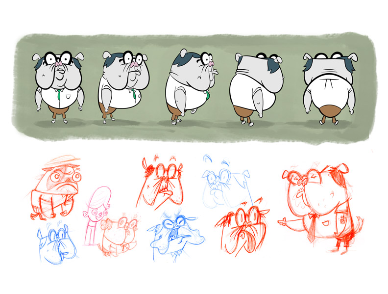
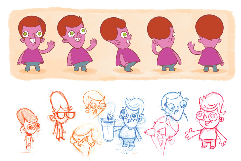
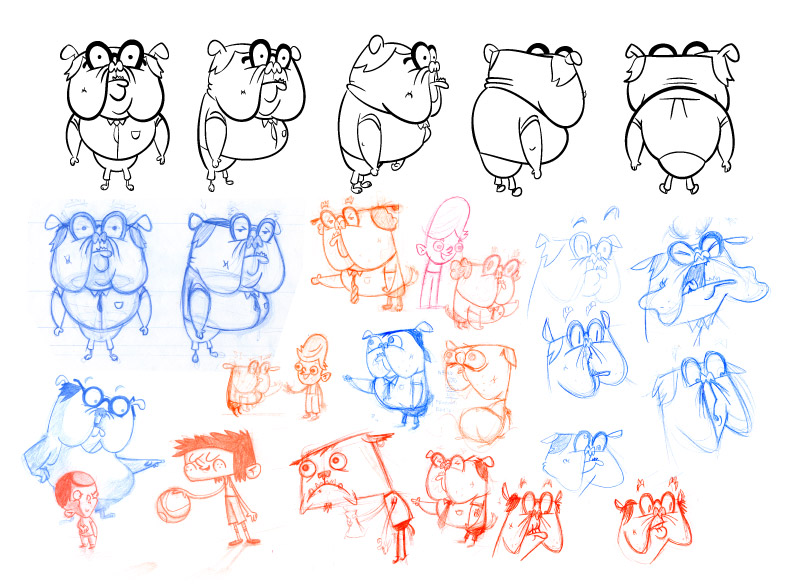
I bought the cheapest fountain pen that I could find a few weeks ago, and it’s been more of a treat than I expected. The fountain pen has a feel different from the ballpoint and rollerball pens that replaced it as the office mainstay, and its characteristics make it well suited to quick sketching. It takes very little pressure to make a line, and the ink flow keeps up with fast strokes when other pens might start to skip or sputter.

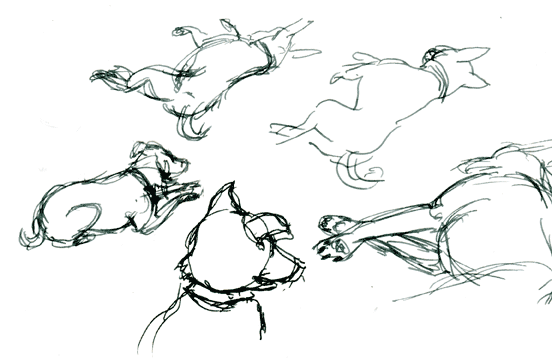
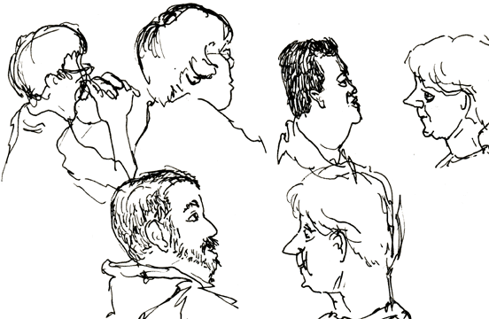
The fountain pen does demand more care and attention than disposable pens, though. It wants to be stored upright to keep ink from drying in the nib. Standard fountain pen inks are not waterproof and the waterproof one I’ve tried is not a very deep black and requires a lot of scribbling to get flowing after the pen sits. The light lines in the drawings above come from refilling the ink before letting the nib thoroughly dry after washing it out with water, so I’m still getting the hang of that ritual. I’ve also heard that fountain pens don’t take well to air travel, where changes in air pressure can force them to leak.

All in all, a fun tool to have in the box, but maybe not the pocket (at least without a pocket protector).

comments (1)
May 7th, 2009

Gesture drawing is something I haven’t done much of. I never saw the point of making scribbly loose drawings that didn’t look much like the thing I was trying to depict, instead preferring to work around the outside of the subject and define it with contour lines.

But I’m about halfway through the first volume of “Drawn to Life”, the compiled notes of Disney animator Walt Stanchfield, and the point of those scribbles is starting to become clear. When I first cracked the book, I was surprised to see so many words in a thick book about drawing, but Stanchfield’s lecture notes from years of drawing courses given to Disney artists reveal the mind of a man with a great understanding of his own process and purpose in creating and a desire to share these things with others.

In studying the drawings in the book and trying to approach drawing in a way that produces a similar result, I’ve found that making quick, loose drawings is liberating. The point of gesture drawing is not to make a fine rendering of the subject on a piece of paper, but to engage the mind and the eye in noticing the angles and shapes that communicate most strongly — to develop an awareness of body language that the animator can draw on when bringing to life figures of the imagination. Gesture drawing is a technique for learning!

Stanchfield recommends drawing in ink to encourage the mind to develop a greater sense of intent before placing a mark, and I have to say it feels like the equivalent of weight lifting for drawing. After spending some time working in ink, the pencil feels lighter and more fluid in my hand.

Don Hahn, who compiled the Stanchfield’s notes for publication and produced “Beauty and the Beast” and “The Lion King” among other films, is going to be appearing at the next Animation Night at The Animation Academy in Burbank on June 7th. If you’re in the Los Angeles area, come check it out.

Sadly, Stanchfield passed away in 2000, but many thanks to Hahn for the wonderful job he has done preserving Stanchfield’s spirit and sharing it with other artists through these notes.

comments (2)
April 3rd, 2009

I added some color to these characters and culled the sketches to improve the overall presentation. I like how the finished character with looks next to some development artwork.

Dog teaches P.E., Dad is a graphic designer, Boy is protected from gainful and/or crushing employment by child labor statutes.

April 3rd, 2009

I found another Photoshop brush I like. You can set the “color dynamics” brush property to mix foreground and background colors as you draw. The mix between a light foreground and dark background color is controlled by the Wacom pen’s tilt, making it possible to sketch with a range of values and easily lay down light over dark. I also like the smeared look it gives. When drawing colors set to gray and white, it kind of feels like India ink mixed with white gouache, and with the light orange and white it I imagine it feels like a thin oil wash.

And, I figured out how to save a single brush in Photoshop, so that when I come up with something I like I can hang onto it! The secret is…

  • Once you’ve tweaked a brush’s settings to your liking, select “New Brush Preset” from the Brushes palette menu to create a new brush that preserves those settings.
  • Then, select “Preset Manager” from the Brushes palette menu; in the resulting dialog, select the brush you want to save — it can be hard because you only have a thumbnail view to work with here.
  • Then click “Save Set”. The resulting set will contain only the brush you’ve selected.

That last bit was the trick. I didn’t realize you could select individual brushes in the preset manager. I though you could only save a set of all the currently loaded brushes. So, easy!

But it would still be cool if you could just drag a brush to the desktop.

March 17th, 2009

Playing with brushes in Photoshop and a pressure-sensitive pen tablet. The options are overwhelming at first, but it’s a great medium for experimentation. Don’t like that stroke? Undo. Or erase. Or color over it. Any color can be completely opaque or a light wash. No paint to mix. Nothing to clean up.

March 15th, 2009

To get better acquainted with the brush tool in Photoshop, I took this scene concept and tried painting some variations of it. The first color attempts were rough, so I removed that variable to focus on value relationships.

I’d previously tried doing the same thing with a set of gray Prismacolor markers, and I have to say that the malleability of a digital drawing is a boon to the novice. On paper, one can only work from light to dark, but in Photoshop, one can try going lighter at any time.

It seems like there are an infinite number of ways to present this simple scene, a single tree on a hill, varying time of day/lighting/contrast and perspective relationship between foreground and background. It was a good exercise to think about the choices, and see the different moods created by varying the lighting/time of day and the perspective relationship between foreground and background.

March 14th, 2009
March 8th, 2009

Another turnaround I did in Character Design at The Animation Academy.

March 8th, 2009

A five-pose character turnaround completed in the Character Design I class taught by Charles Zembillas at The Animation Academy.