

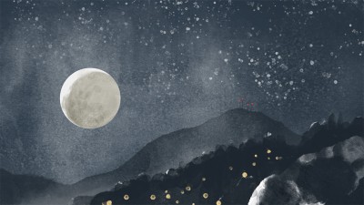
A quick sketch of the Verdugo Mountains done in Photoshop, based on an iPhone picture snapped on my drive home from work. The day’s last direct light was hitting the tops of the Verdugo Mountains like a spotlight, and I wanted to try to replicate the change in contrast and hue where the shadow crept up the hill. Also interesting, the San Gabriel Mountains in the distance were getting some light spilled on them in a similar fashion, but the contrast and value were much lighter due to light scattering in atmosphere. Getting the value and contrast right gives them that feeling of distance, so thank you Photoshop for being able to tweak that without consequence until it looked right.

May 27th, 2014
Bought a great set of “watercolor” brushes for Photoshop by Kyle T. Webster and was playing around with them. Still trying to get used to what they can do, but I like them for adding texture for naturalistic effects or to break up areas that would otherwise be too smooth and solid.
comments (0)

August 11th, 2013
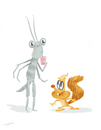
The tree lobster, once thought to be extinct, lives only on a rocky outcropping in the Tazmanian Sea. Isolated from outside influence for hundreds of years, they have perfected a variety of delicious blended drinks unlike anything else in the world.
comments (0)

August 11th, 2013
Some more Photoshop painting practice. I’ve been looking at a lot of bike parts lately, and the different materials and finishes of these stems seemed like good subjects for study of how light creates the impression of their surface qualities. After spending a bit of time on these, it was clear they would have benefited from more time spent on creating a solid drawing, but it was still worthwhile. There’s just something deeply satisfying about shiny things.
comments (0)

August 11th, 2013
Had this interview with illustrator Claire Robertson on The Setup open in NetNewsWire when I was in the mood to put into practice some Photoshop painting techniques I’d been learning about over on Ctrl+Paint. The free Digital Painting 101 series and the $10 Basic Photoshop Rendering Series were full of clever techniques for working with layers and blending along with fundamental concepts of light and shadow.
comments (0)

August 15th, 2009
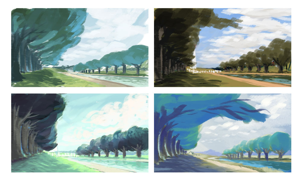
Some more Photoshop color studies of trees in perspective. Not dissimilar from the last batch, but sourced from the other side of the country. These are based on a watercolor sketch that I did on the National Mall in Washington D.C.
I chose a vantage point that obscured all recognizable monuments, though the version in the upper right hints at the Washington Monument and the WWII Memorial. The colors in this one are also sampled from a photograph, making them more real, but less overtly harmonic than the other versions. The colors in the other three images I choose myself based on memory, and it’s curious how the outcomes are so similar, and so different from what the camera recorded.
comments (0)
June 15th, 2009
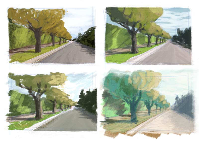
I scanned a thumbnail sketch of a street scene from a while back and played around with painting it in Photoshop, with the goal of building familiarity with mixing colors and tweaking brushes in the program.
For the first version (upper left), I selected colors using the eyedropper on the original photograph. For the next two, I looked at other pictures and paintings and mixed colors using the HSB sliders in the color palette, trying to copy some of those images’ color biases in light and shadow.
In the last version (lower right), I just mixed colors based on what I remembered from the previous scenes and tried to use colors across the image that felt related.
comments (0)

April 3rd, 2009
I found another Photoshop brush I like. You can set the “color dynamics” brush property to mix foreground and background colors as you draw. The mix between a light foreground and dark background color is controlled by the Wacom pen’s tilt, making it possible to sketch with a range of values and easily lay down light over dark. I also like the smeared look it gives. When drawing colors set to gray and white, it kind of feels like India ink mixed with white gouache, and with the light orange and white it I imagine it feels like a thin oil wash.
And, I figured out how to save a single brush in Photoshop, so that when I come up with something I like I can hang onto it! The secret is…
- Once you’ve tweaked a brush’s settings to your liking, select “New Brush Preset” from the Brushes palette menu to create a new brush that preserves those settings.
- Then, select “Preset Manager” from the Brushes palette menu; in the resulting dialog, select the brush you want to save — it can be hard because you only have a thumbnail view to work with here.
- Then click “Save Set”. The resulting set will contain only the brush you’ve selected.
That last bit was the trick. I didn’t realize you could select individual brushes in the preset manager. I though you could only save a set of all the currently loaded brushes. So, easy!
But it would still be cool if you could just drag a brush to the desktop.

March 19th, 2009
It’s also possible to approach color and lighting through trial and error, by using the Adjust Color dialog in Photoshop. Here, I took the bright tree at the top, adjusted the colors with a time of day in mind and then tried to sketch in other environmental details as they would appear at that time of day.
The middle image is what I imagine I might see on a day hike, rounding the trail from the shady side of the mountain and emerging into direct sunlight.
The bottom image is of a daily experience in Los Angeles, looking westward during a short window of time when the low sun silhouettes trees and hills against the tinted sky and the atmospheric haze sets the layers apart.
I’ve been noticing lighting details like this when I’m out an about, trying to commit them to memory or taking a picture for later study.
comments (0)