“I am soooooo delicious.”
Typical donut stuff.

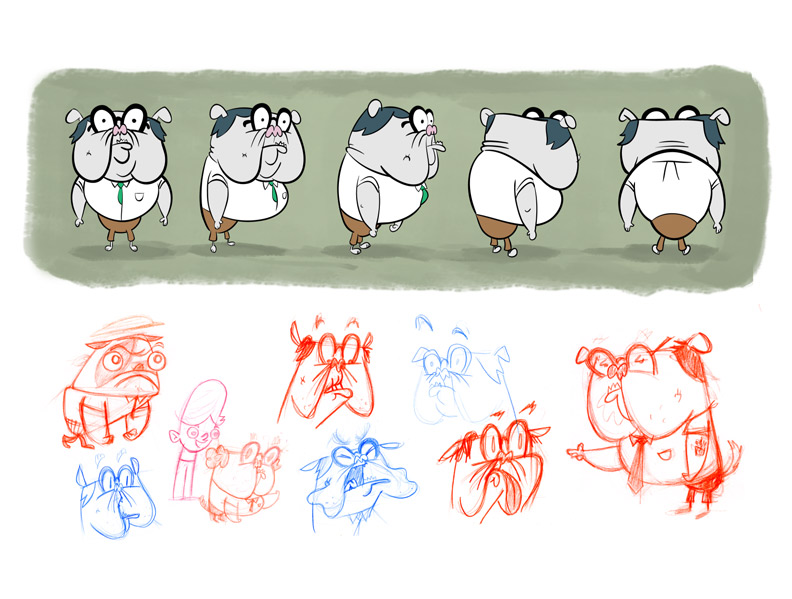
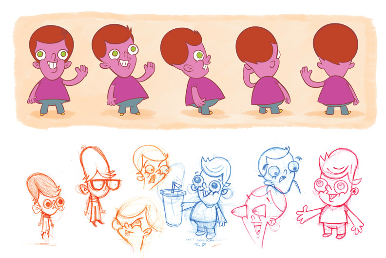
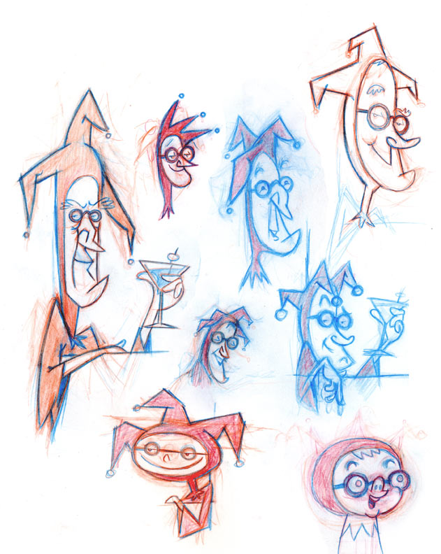
I added some color to these characters and culled the sketches to improve the overall presentation. I like how the finished character with looks next to some development artwork.
Dog teaches P.E., Dad is a graphic designer, Boy is protected from gainful and/or crushing employment by child labor statutes.
I found another Photoshop brush I like. You can set the “color dynamics” brush property to mix foreground and background colors as you draw. The mix between a light foreground and dark background color is controlled by the Wacom pen’s tilt, making it possible to sketch with a range of values and easily lay down light over dark. I also like the smeared look it gives. When drawing colors set to gray and white, it kind of feels like India ink mixed with white gouache, and with the light orange and white it I imagine it feels like a thin oil wash.
And, I figured out how to save a single brush in Photoshop, so that when I come up with something I like I can hang onto it! The secret is…
That last bit was the trick. I didn’t realize you could select individual brushes in the preset manager. I though you could only save a set of all the currently loaded brushes. So, easy!
But it would still be cool if you could just drag a brush to the desktop.
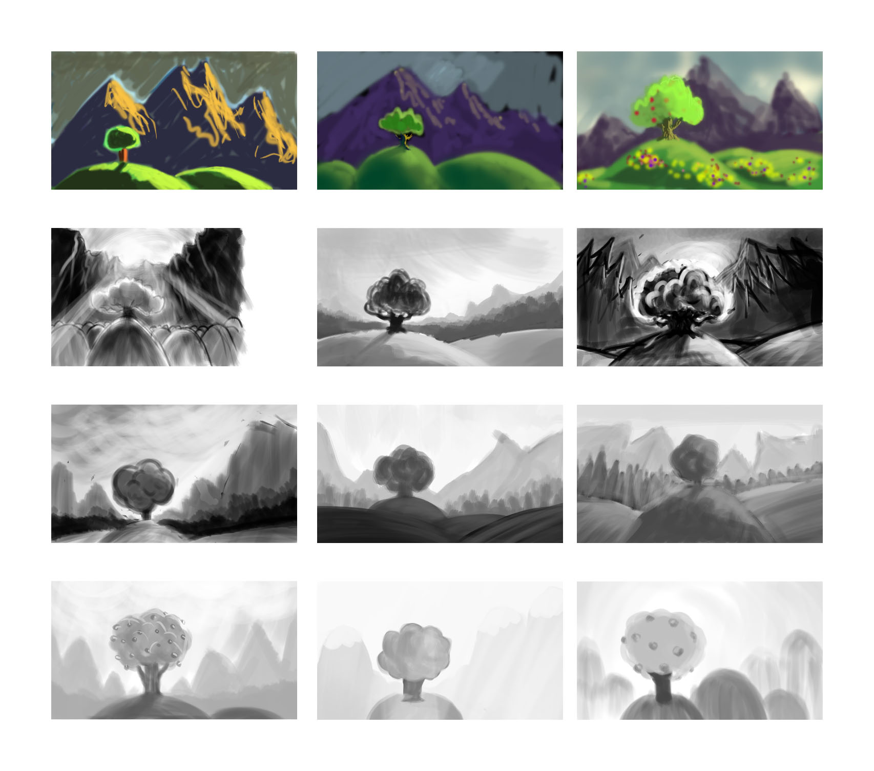
It’s also possible to approach color and lighting through trial and error, by using the Adjust Color dialog in Photoshop. Here, I took the bright tree at the top, adjusted the colors with a time of day in mind and then tried to sketch in other environmental details as they would appear at that time of day.
The middle image is what I imagine I might see on a day hike, rounding the trail from the shady side of the mountain and emerging into direct sunlight.
The bottom image is of a daily experience in Los Angeles, looking westward during a short window of time when the low sun silhouettes trees and hills against the tinted sky and the atmospheric haze sets the layers apart.
I’ve been noticing lighting details like this when I’m out an about, trying to commit them to memory or taking a picture for later study.
The textures and variable opacity of Photoshop brushes are good for both hinting at the textures of foliage and simulating the effects of natural media.
More experimentation with brush shape and texture in Photoshop, this time trying to copy lighting and color from photographs.
Using the eyedropper to sample a color from a photograph and moving sliders around, rather than squirting paints out of a tube and mixing them together with a brush…feels like cheating. But it’s a good way to quickly see what the dominant colors in an image are. I’m always surprised by what sampled colors look like out of the context of their original image, and I hope to develop a better sense for seeing colors in place with practice.
Playing with brushes in Photoshop and a pressure-sensitive pen tablet. The options are overwhelming at first, but it’s a great medium for experimentation. Don’t like that stroke? Undo. Or erase. Or color over it. Any color can be completely opaque or a light wash. No paint to mix. Nothing to clean up.
To get better acquainted with the brush tool in Photoshop, I took this scene concept and tried painting some variations of it. The first color attempts were rough, so I removed that variable to focus on value relationships.
I’d previously tried doing the same thing with a set of gray Prismacolor markers, and I have to say that the malleability of a digital drawing is a boon to the novice. On paper, one can only work from light to dark, but in Photoshop, one can try going lighter at any time.
It seems like there are an infinite number of ways to present this simple scene, a single tree on a hill, varying time of day/lighting/contrast and perspective relationship between foreground and background. It was a good exercise to think about the choices, and see the different moods created by varying the lighting/time of day and the perspective relationship between foreground and background.